MENU

V

V

Titan Engineers & Constructors

Construction & Engineering Company

Project Nature

Branding/Visual Identity

ABOUT PROJECT

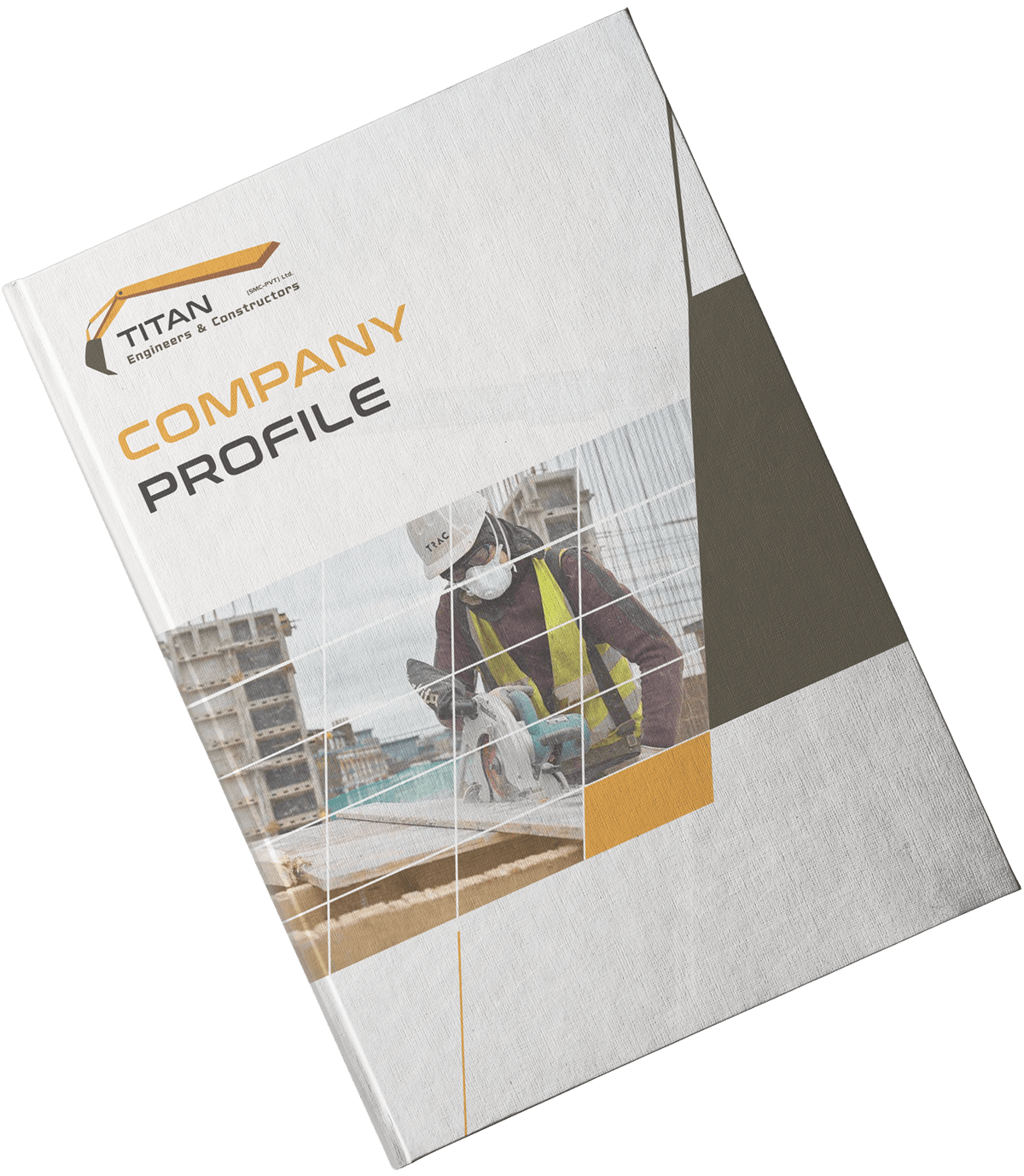
Titan, a big name in construction and engineering industry presented to us with an overall identity revamp. We started from choosing the appropriate color scheme that best defined the personality of the brand and end up designing all collaterals including their business cards, letterhead & company profile. Since then, Titan has revitalized itself and reclaimed it’s positioning in the market.
Project Deliverables

Begin Then

Educational & Infotainment Platform

ABOUT PROJECT

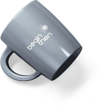
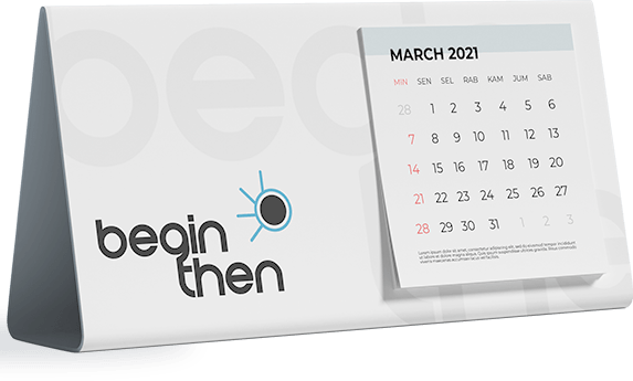
Begin Then, an educational platform of the modern times being a physical learning institute with an infotainment/educational YouTube channel. Its founders came to us for a complete branding strategy that can connect it to its audience in meaningful ways. With a sound strategy we designed its visual identity including collaterals to communicate in the most authentic tone of the brand.

Project Nature

Branding/Visual Identity

Meaningful

A meaningful and persuasive set of brand elements reduce the burden on marketing communications to build awareness and link brand associations and equity. Being a semi-virtual platform, offerings of Begin Then are less concrete which is why we put more importance on brand elements in a bid to capture the intangible characteristics of the brand.

Aesthetically Pleasing

Creating the brand’s personality aesthetically pleasing is at the core of everything we do. Every design, every detail all purposefully crafted to give an aesthetically pleasing look to the brand and its elements.  Mugs, Calendars, pen drives, paper weight all these little things have a huge impact over the equity building efforts of the brand.

Leema Ceilings

Construction & Renovation Company

Project Nature

Branding/Visual Identity

ABOUT PROJECT

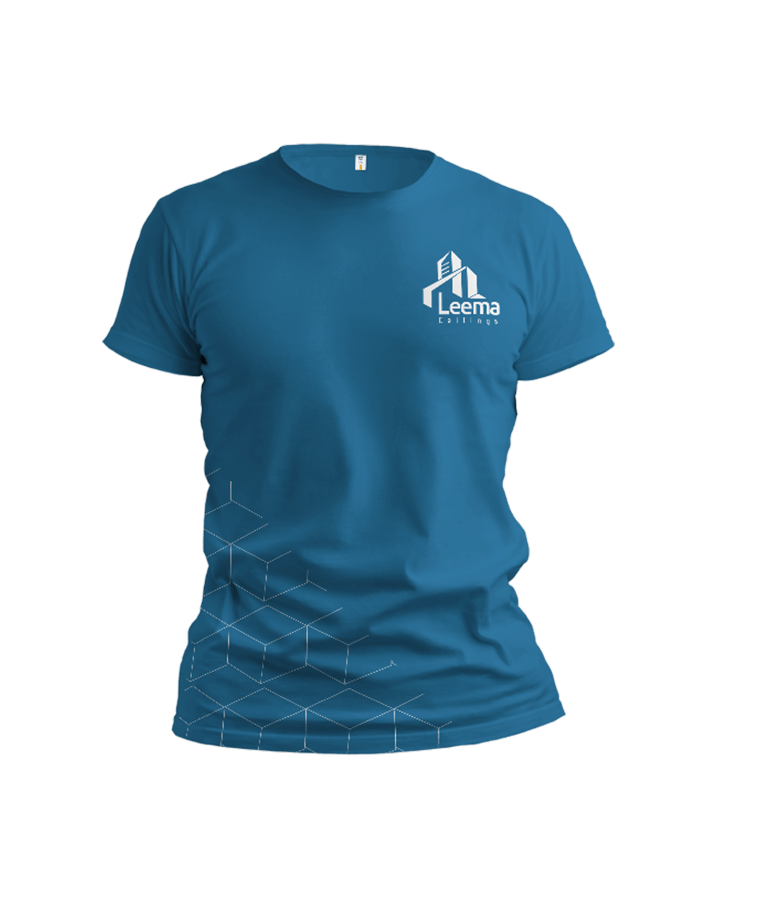
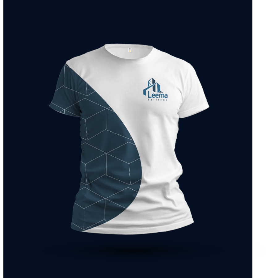
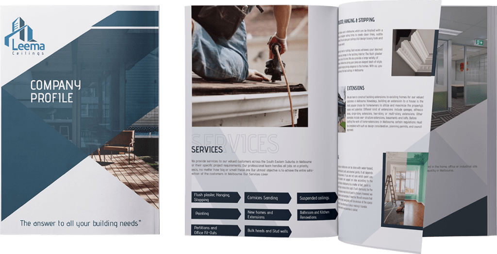
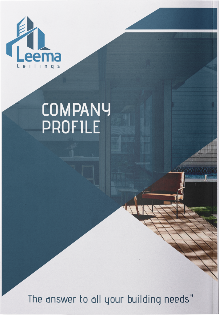
Leema Ceilings, Melbourne based Construction and Renovation Company with a long history that hardly anyone remembered before we did its complete brand transformation to help it takeover the market again with its fresh new look that also included hints of old identity to preserve the legacy and experience.

Project Deliverables

COMPANY
PROFILE

Core Fit Meals

Healthy Diet Meals

Project Nature

Branding/Visual Identity

ABOUT PROJECT

Core Fit Meals, an Online Restaurant offering healthy diet meal at the door step to its customers. For them, we created the entire branding strategy starting from the visual identity to its packaging. We had to create something that feels healthy and fun with a touch of fit lifestyle.  

Project
Deliverables

Tea-Thru

Drive-thru Tea Service

Project Nature

Branding/Advertising

ABOUT PROJECT

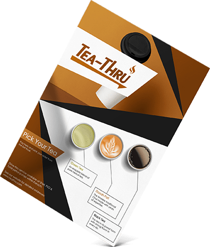
Tea-Thru serves tea on fuel stations by Drive-thru operating procedure. Presented to us by its founders to design the entire branding strategy and print ads before its launch we created its visual identity to complement the time-saving nature of the business and also communicated in the language of Tea by including tea colors in its palette throughout the branding.

Flyers

We streamlined the process for Tea-Thru to make flyers and all other sales collaterals the best way possible. Designed multiple sales collaterals with creative and exciting visuals that communicated descriptive and persuasive messages of the brand quite effectively. 

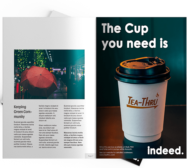
MAGAZINE AD

We created Ads that talked to the audience in the best way thanks to our creative design aesthetics and the copywriting that is accurate, compelling and champions the tone and voice of the brand.

Titan Engineers & Constructors

Construction & Engineering Company

Project Nature

Branding/Visual Identity

ABOUT PROJECT

Titan, a big name in construction and engineering industry presented to us with an overall identity revamp. We started from choosing the appropriate color scheme that best defined the personality of the brand and end up designing all collaterals including their business cards, letterhead & company profile. Since then, Titan has revitalized itself and reclaimed it’s positioning in the market.
Project Deliverables

Begin Then

Educational & Infotainment Platform

ABOUT PROJECT

Begin Then, an educational platform of the modern times being a physical learning institute with an infotainment/educational YouTube channel. Its founders came to us for a complete branding strategy that can connect it to its audience in meaningful ways. With a sound strategy we designed its visual identity including collaterals to communicate in the most authentic tone of the brand.

Project Nature

Branding/Visual Identity

Meaningful

A meaningful and persuasive set of brand elements reduce the burden on marketing communications to build awareness and link brand associations and equity. Being a semi-virtual platform, offerings of Begin Then are less concrete which is why we put more importance on brand elements in a bid to capture the intangible characteristics of the brand.

Aesthetically Pleasing

Creating the brand’s personality aesthetically pleasing is at the core of everything we do. Every design, every detail all purposefully crafted to give an aesthetically pleasing look to the brand and its elements.  Mugs, Calendars, pen drives, paper weight all these little things have a huge impact over the equity building efforts of the brand.

Leema Ceilings

Construction & Renovation Company

Project Nature

Branding/Visual Identity

ABOUT PROJECT

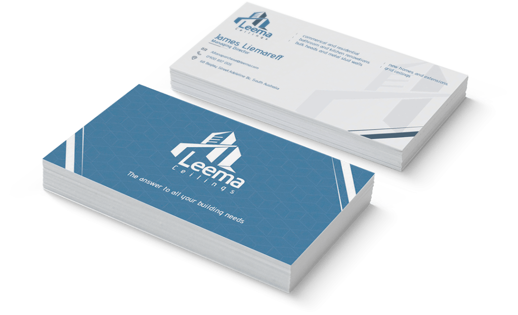
Leema Ceilings, Melbourne based Construction and Renovation Company with a long history that hardly anyone remembered before we did its complete brand transformation to help it takeover the market again with its fresh new look that also included hints of old identity to preserve the legacy and experience.

Project Deliverables

COMPANY PROFILE

Core Fit Meals

Healthy Diet Meals

Project Nature

Branding/Visual Identity

ABOUT PROJECT

Core Fit Meals, an Online Restaurant offering healthy diet meal at the door step to its customers. For them, we created the entire branding strategy starting from the visual identity to its packaging. We had to create something that feels healthy and fun with a touch of fit lifestyle.  

Project Deliverables

Tea-Thru

Healthy Diet Meals

Project Nature

Branding/Advertising

ABOUT PROJECT

Tea-Thru serves tea on fuel stations by Drive-thru operating procedure. Presented to us by its founders to design the entire branding strategy and print ads before its launch we created its visual identity to complement the time-saving nature of the business and also communicated in the language of Tea by including tea colors in its palette throughout the branding.

MAGAZINE AD

We created Ads that talked to the audience in the best way thanks to our creative design aesthetics and the copywriting that is accurate, compelling and champions the tone and voice of the brand.

Flyers

We streamlined the process for Tea-Thru to make flyers and all other sales collaterals the best way possible. Designed multiple sales collaterals with creative and exciting visuals that communicated descriptive and persuasive messages of the brand quite effectively. 

CONTACT

Let’s connect with us to get started!